Edinburgh Marathon
Festival
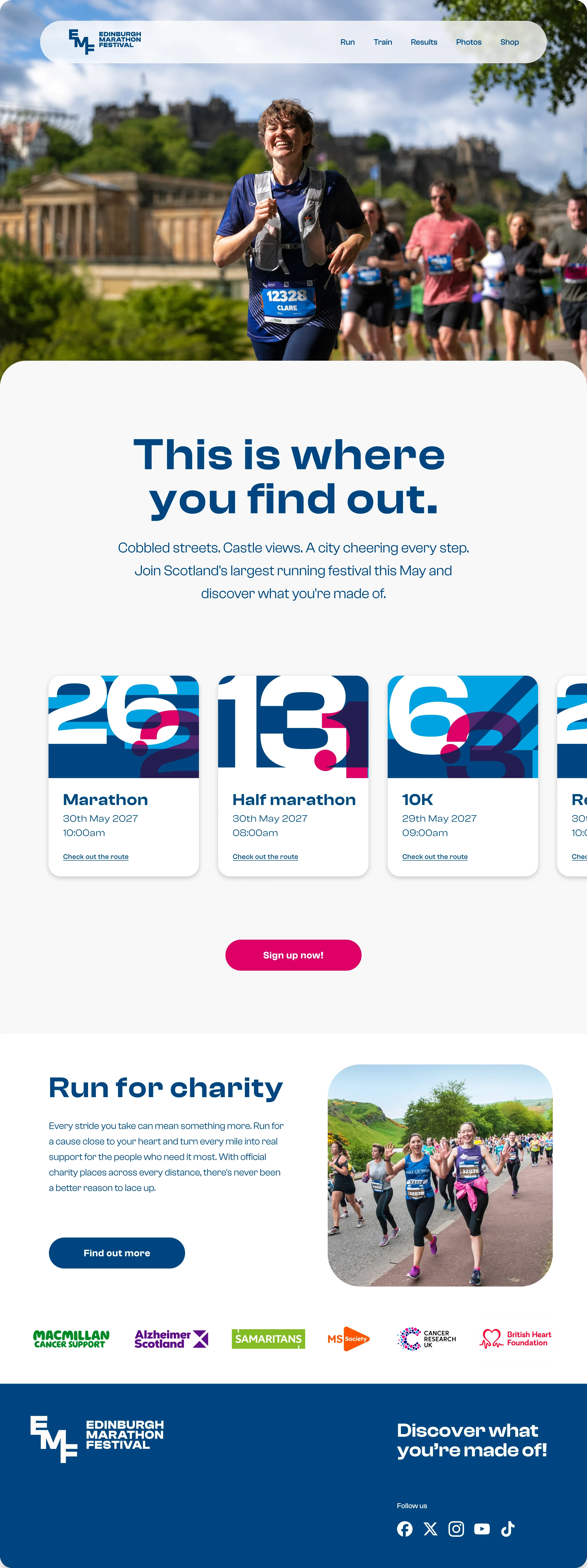
A personal reimagining of the Edinburgh Marathon Festival identity — unsolicited, self-initiated, and built purely to explore how far the brand could go.
A city-wide festival: three days of racing, closed roads, thousands of runners. I've run EMF multiple times and know the pace and atmosphere of the weekend first-hand. Visually though, the identity felt disconnected from the scale of it. This is my take on what it could be.

The idea
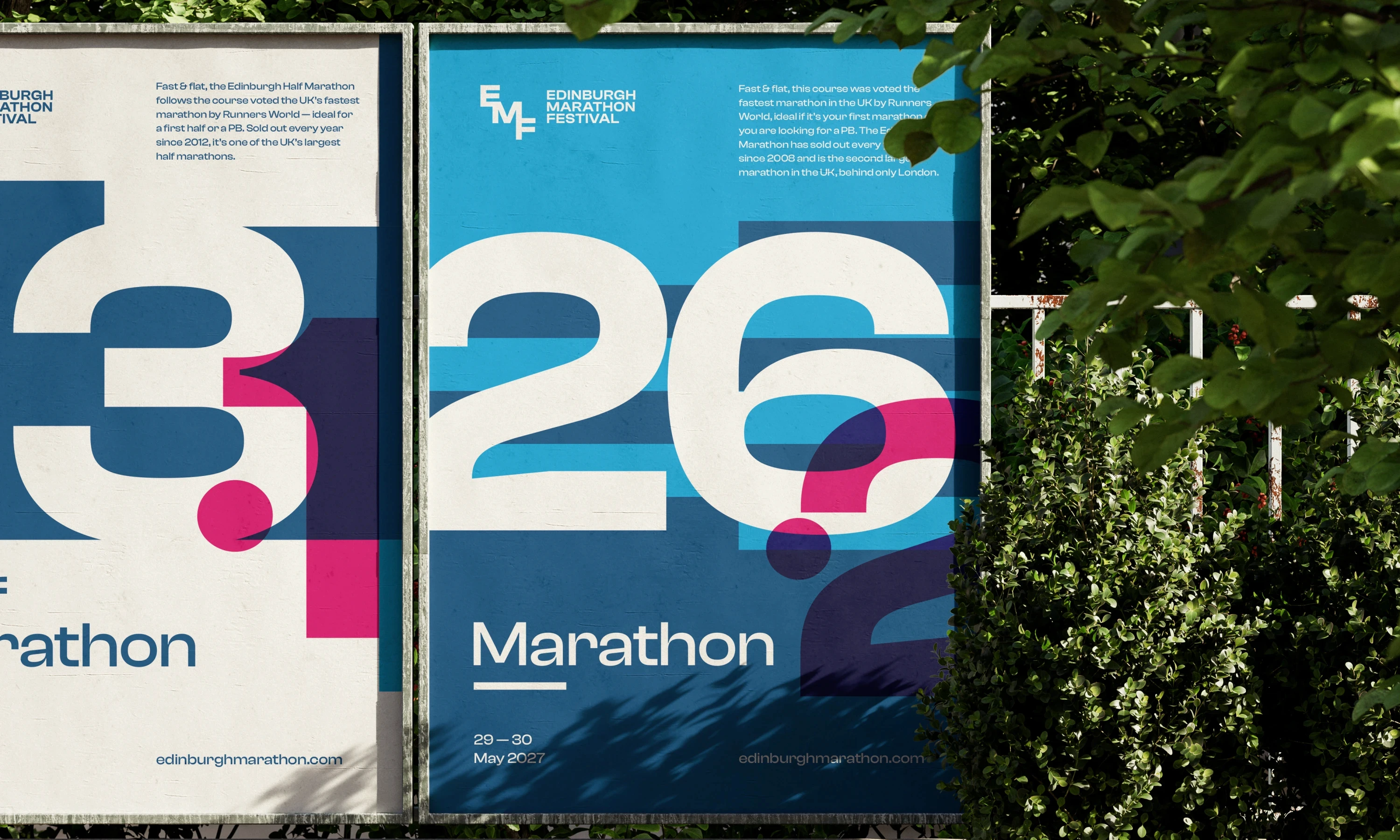
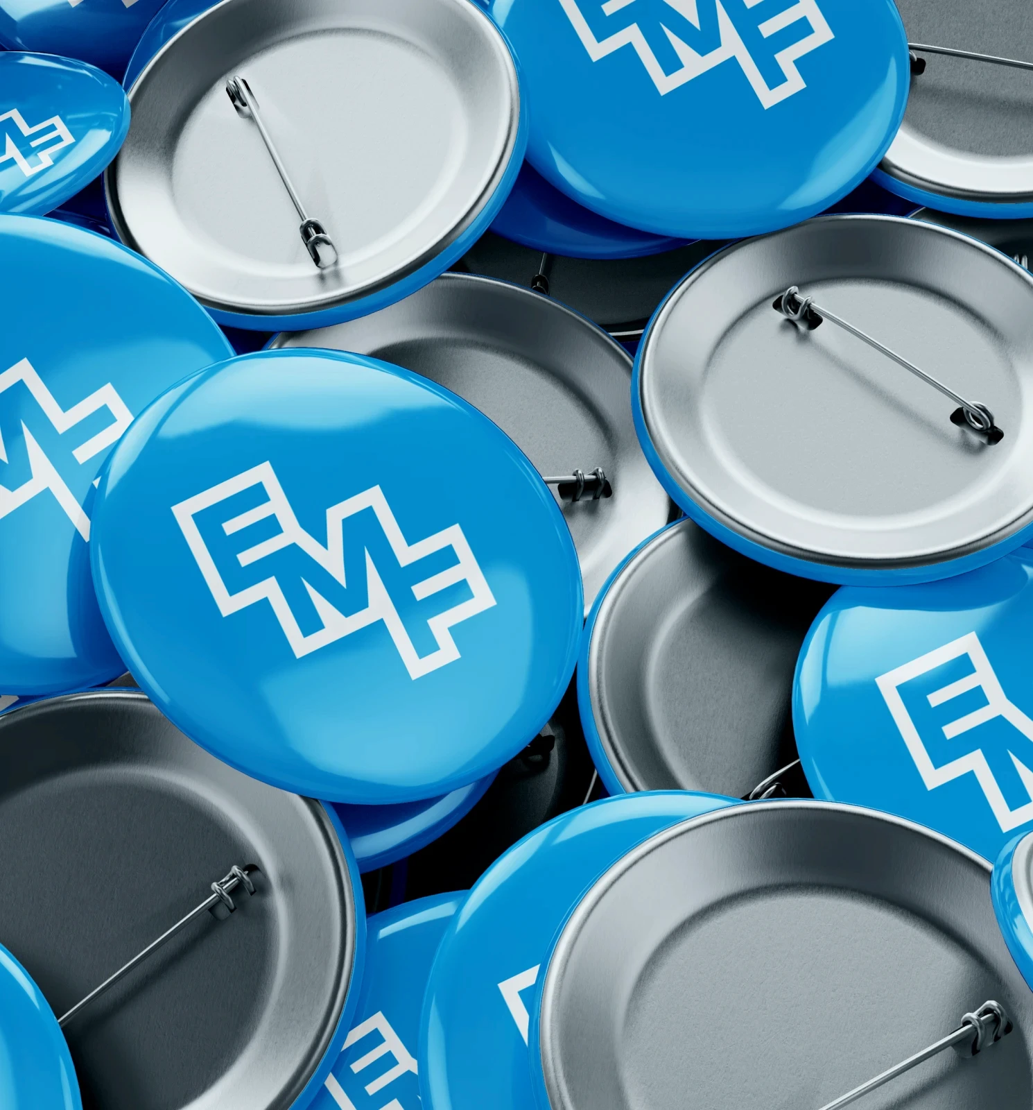
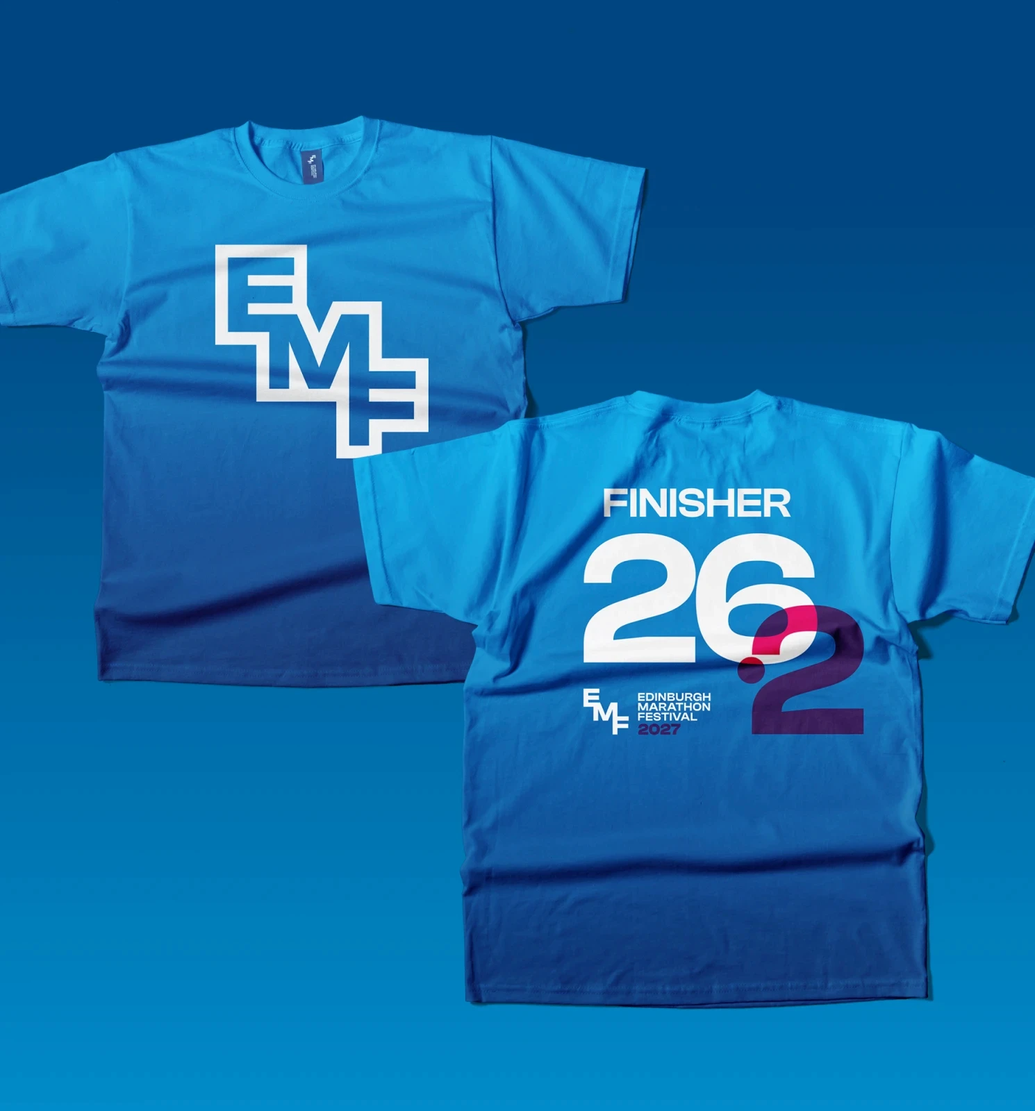
The logo takes an abstract cue from the architecture of Edinburgh Castle and the city streets shaped by layers of history, with new structures built directly over the old.
Those stacked, staggered levels become the basis of the mark, creating a simple graphic that feels distinctly Edinburgh.
The bold parallel lines extend the idea into the world of running, echoing the lane markings of a track and bringing pace and movement to the identity.